Purpose
To provide a centralized Practice Network and build occupational therapy’s community and capacity for anti-oppressive and accountable systems and practices. The core aim is to address access, equity, diversity, and inclusion within the occupational therapy workforce and education. We collectively share, build and develop experiences and approaches to equity, diversity and inclusion in and by occupational therapy.
Objectives
- To establish a nation-wide network among OTs focused on justice initiatives
- To develop a mentoring community for and with under-represented occupational therapists
- To identify multi-level issues of systemic oppression affecting occupational therapy
- To provide recommendations for multi-level and context-specific inclusive and accountable practices
- To engage in knowledge-sharing/dissemination to support equitable and inclusive OT practice and education that redresses/repairs systemic harms
- To enhance cultural safety and cultural humility among occupational therapy practitioners, educators, and students
- Collaborate with other CAOT practice networks around shared intentions and projects
Co-chairs
Hiba Zafran: hiba.zafran@mcgill.ca
Tal Jarus: tal.jarus@ubc.ca
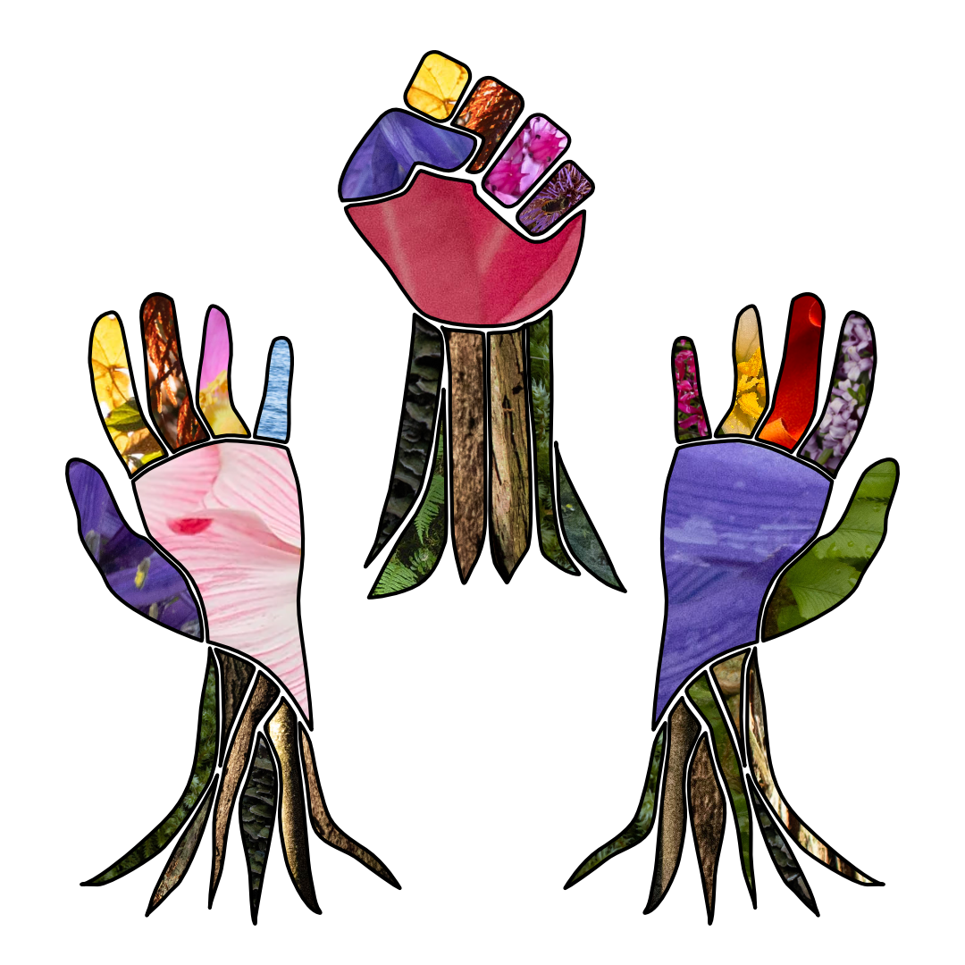
Logo image: Connection, Solidarity, and Gratitude
Description
The symbol of a raised fist stands for solidarity. In the foreground are two hands that are raised to express gratitude and greeting with warmth and love, embracing what we can do together to promote equity, justice and belonging in solidarity. The three hands are positioned as trees that are growing. They blossom in different ways and nourish each other. The hands are filled with plants and nature elements to represent the connections we all have between our health, wellbeing and the land, highlighting the links between occupational and environmental justice. The tree trunks include images of Douglas Firs, Cedars, and Sitka Spruces, as well as mosses and fungi that grow on trees. Most are Indigenous species to the lands currently called Canada including Camas, Arbutus, Nootka Rose, Trillium, Licorice fern, and moss - while some originally arrived from distant soils. The rainbow colors of the boughs and blossoms represent diversity amongst occupational therapists.
About the design consultation process
In a virtual meeting, the practice network went into four groups and each explored what each of the concepts (“Justice”, “Equity”, “Diversity” and “Inclusion”) meant to them, and what they hoped for, in relation to occupational therapy, health, and community. The wider practice network was then able to contribute their perspectives on a shared document. The designer drew on the themes and desires shared by the network members, and in collaboration with the co-chairs submitted three designs to propose for members to vote on over a 2-week period, with the chosen logo receiving 61.3% of the votes.
About the designer and influences on her perspective
The logo was designed by Anna Braunizer in consultation with and as a member of the CAOT JEDI Practice Network. Anna Braunizer is a queer, neurodivergent, middle-class woman who emigrated from England and Austria as a child and gratefully lives on the unceded Land stewarded by the lək̓ʷəŋən, known today as the Esquimalt and Songhees Nations, the W̱SÁNEĆ, the Pauquachin, the T’Souke, the Khowutzun, and the Pacheedat since time immemorial. She is largely self-taught with graphic design, learning through experimentation, play, face painting as a summer camp leader, and learning about art in general from many people, books, galleries, performances, and friends. Anna is learning about healing the land/environmental stewardship specific to W̱SÁNEĆ in land-based workshops led by Tiffany Joseph and Sarah Jim, and is encouraged to learn and practice saying the Indigenous names of plants as part of language revitalization. To learn the names of the plants in SENĆOŦEN.
Join us!
If you wish to become a member, send us an email at networks@caot.ca.